At SeatGeek, I led the full design of Season Express, a project aimed at helping enterprise clients like the Cleveland Cavaliers or Dallas Cowboys configure their seasons and ticket packages.
SeatGeek's enterprise platform facilitates 15-25 million ticket sales a year worth $2-4 billion. At that scale, even small configuration errors can cost millions in lost revenue for clients. Season setup was one of the most critical pain points in that process, so I worked closely with the Enterprise team to design a solution that better managed ticketing complexity.
Preview
The result was a guided workflow that reduced projected setup time by 47% and emphasized self service, cutting reliance on internal support teams. To do so, I delivered an interactive Next.js prototype connected to live data and pitched the redesign to product, engineering, and design executives, securing its inclusion in the enterprise product roadmap.

Season Express workflow
Making Sense of Ticketing
For the clients we support, season setup is one of the most stressful times of the year.
Ticket Configuration Components
- Venue Maps
- Pricing (Single Game vs. Bundle vs. Season Ticket)
- Suites
- Customer Types
- Ticket Renewals
- Parking
- Taxes
- Fees
- Presales
- Release Dates
These are just some of the moving parts that go into setting up a sports season, often times under tight deadlines from league offices. Needless to say, there's a lot of hidden complexity.
Complexity itself isn't the problem though. Running an enterprise platform at the scale of teams in the NFL, NBA, or Premier League requires flexibility to support needs across sports, leagues, and countries. The problem was that our implementation surfaced too much complexity directly to clients.
Evolution of SeatGeek's enterprise product
When I joined, the team had just shipped a visual overhaul of our enterprise offering. It certainly looked cleaner, but underneath, the architecture and workflows were the same.
Landing page (events preview)
Looking at this landing page, for instance, it's not clear where to even begin setting up a new season. Users had to be trained to use our product, which took 25-60 hours across 6-8 weeks for new clients.
They described it in their own words like this:
💬 "It's harder than it needs to be."
💬 "The work is still pretty tedious."
💬 "What I really need is something unambiguous. I never know if I'm doing it right."
For our users, the experience induced many of the same uneasy feelings most people get filing taxes. It's super important, extremely detailed, overly stressful, and you only know if you got it wrong after it's too late.
Most people also get outside tax help. For us, that meant overloaded client support teams.
More Than Design
But, this wasn't just a usability problem, it was a business problem.
Ticketing contracts run 5-7 years and are worth millions, which makes every client interaction a high-stakes moment. In my first few weeks, I focused not on designing but on listening: interviewing ticket operations staff, team members, solutions architects, and front office executives.
Design team meeting
In negotiations, money is always front and center. Saving time, reducing errors, and avoiding costly mistakes all directly impacts our client's bottom line. But, what also stood out was how clients downplayed their frustrations.
They consistently classified tedious workarounds, both in our tool and in our competitors', as "not inefficient, just time consuming." Their learned helplessness was a signal that the bar was low, which means a strong opportunity for design to make a real business impact.
Building a Mental Model
Workflow Design
When moving from research to design, I quickly realized that the complexity wasn't just about the number of components, but also how disconnected they were.
New season configuration components
Complete season configuration components
Users were expected to configure each piece separately, then somehow stitch them together into a working season. For instance, even season tickets had to be manually connected to a previously created season.
New season ticket settings page
This created confusing and made room for careless human error. More importantly, it reflected a deeper system-level problem: flexibility without guidance. Being unopinionated in design left clients without a clear sense of how to move from start to finish.
So, rather than focusing on polishing the UI, I focused on the workflows, asking:
Key Questions
- What are the jobs to be done?
- How do we split this larger job into individual tasks?
- What information is needed to complete this specific task?
To start addressing these questions, I spent time mapping the problem space and exploring multiple directions before committing to a final workflow.
These explorations weren’t about getting the screens right, but about building confidence in the overall approach. Through many iterations of wireframing, meeting with solutions architects, and starting all over again, I got crystal clarity on not what users said they wanted, but what they actually needed.
Problem space exploration
User understanding diagrams
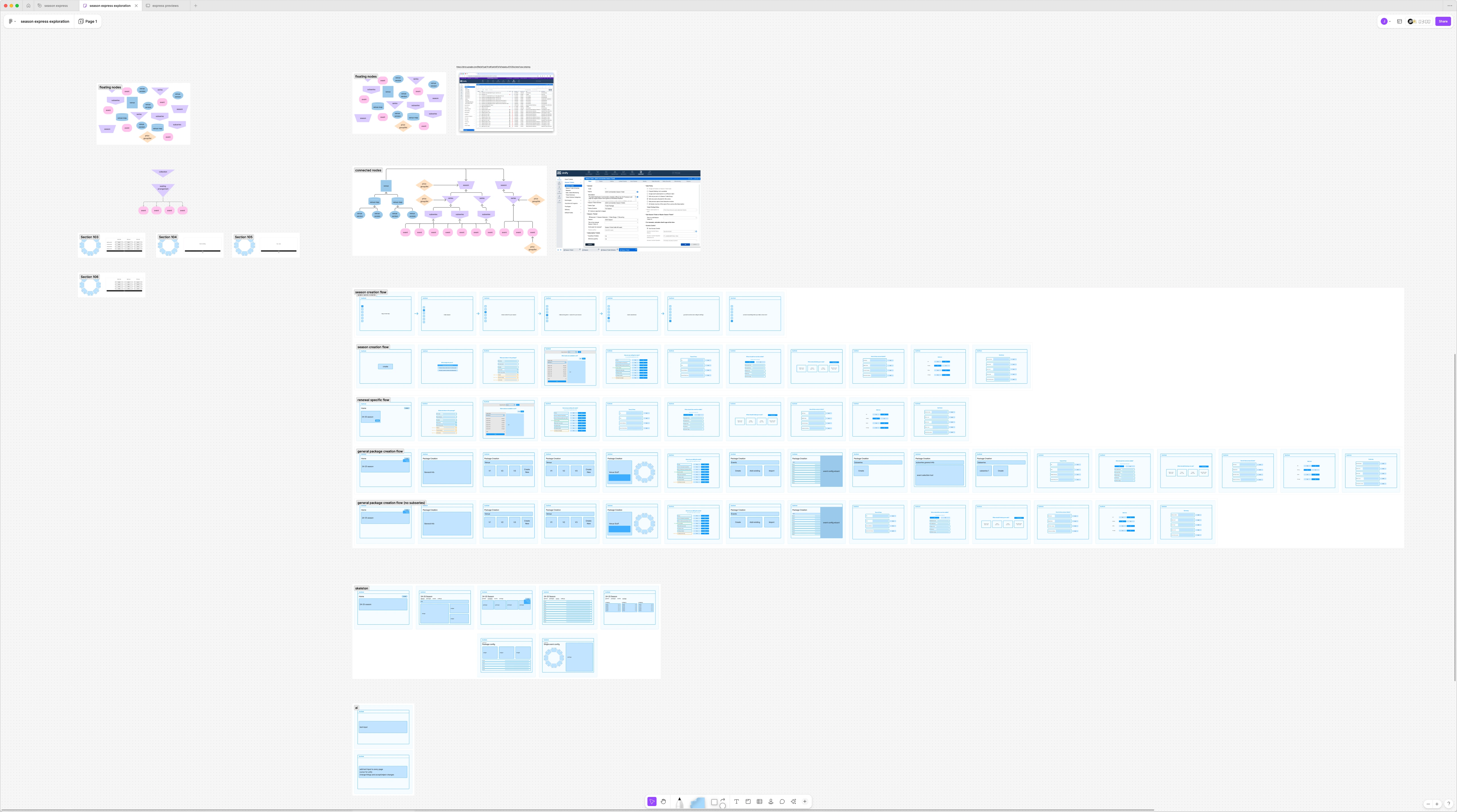
Proposed workflow wireframes
But, even proper sequencing and defined workflows wasn't enough.
From Anxiety to Assurance
As you can probably tell, our UI was implemented like a large control panel filled with knobs and switches. It was difficult to tell the consequences of changing something here or adjusting a setting there. So, it wasn't just guidance, but validation.
Eliminating Redundancy
Finally, clients had to go through this same painful process year after year. In reality, 70-80% of a team's setup stays consistent. If configuration were like growing a tree, each new season was like growing a new branch, yet our system forced users to rebuild the trunk from scratch.
The Solution
To address these issues, the final design completely transformed the season creation experience.
First, a clear hierarchy was established with the season entity at the top level. With this hierachy, only information relevant to that current level was immediately available.
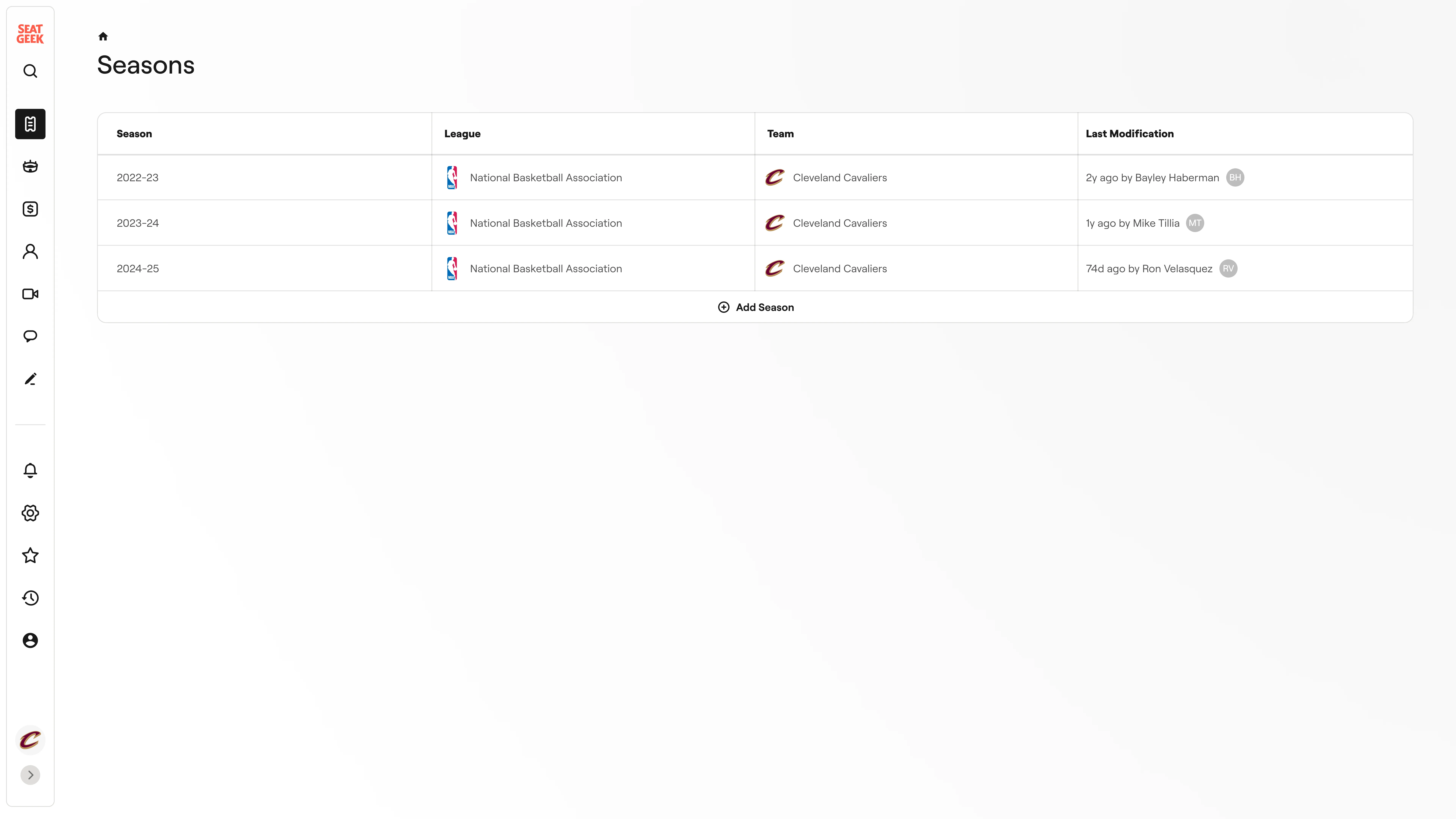
Seasons list
When creating a new season, users are encouraged to build off of the previous season instead of starting from scratch, with a dropdown for more options on what exactly to bring over.
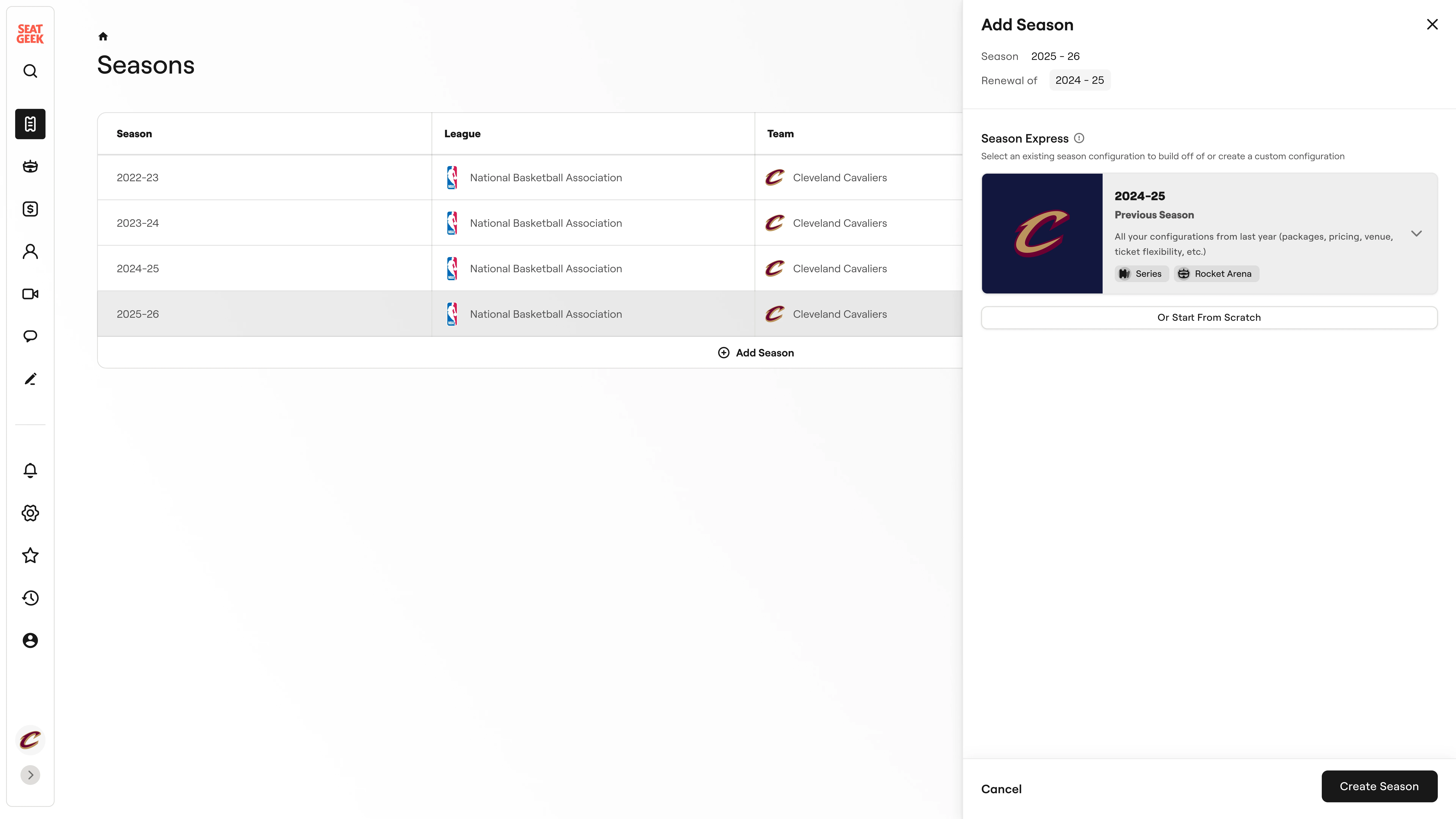
Season creation quick options
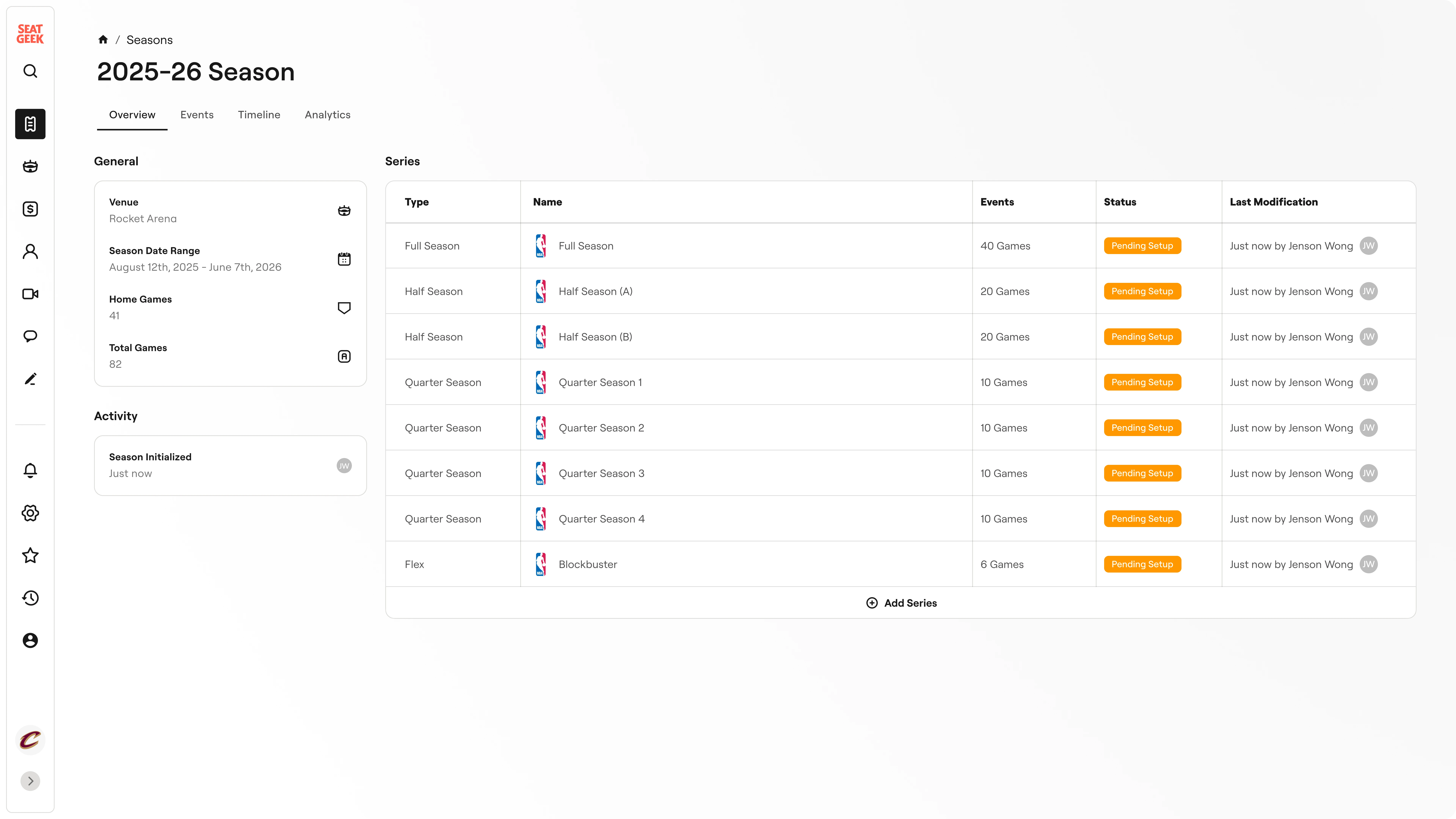
Because of the new hierarchy, new season tickets are automatically pulled in to match the structure of last season, alleviating lots of manual grunt work.
The new page displaying the season tickets also prioritizes clarity over configurability, with chips and status indicators to make clear exactly what actions require attention.
Old season ticket configuration
New season tickets overview
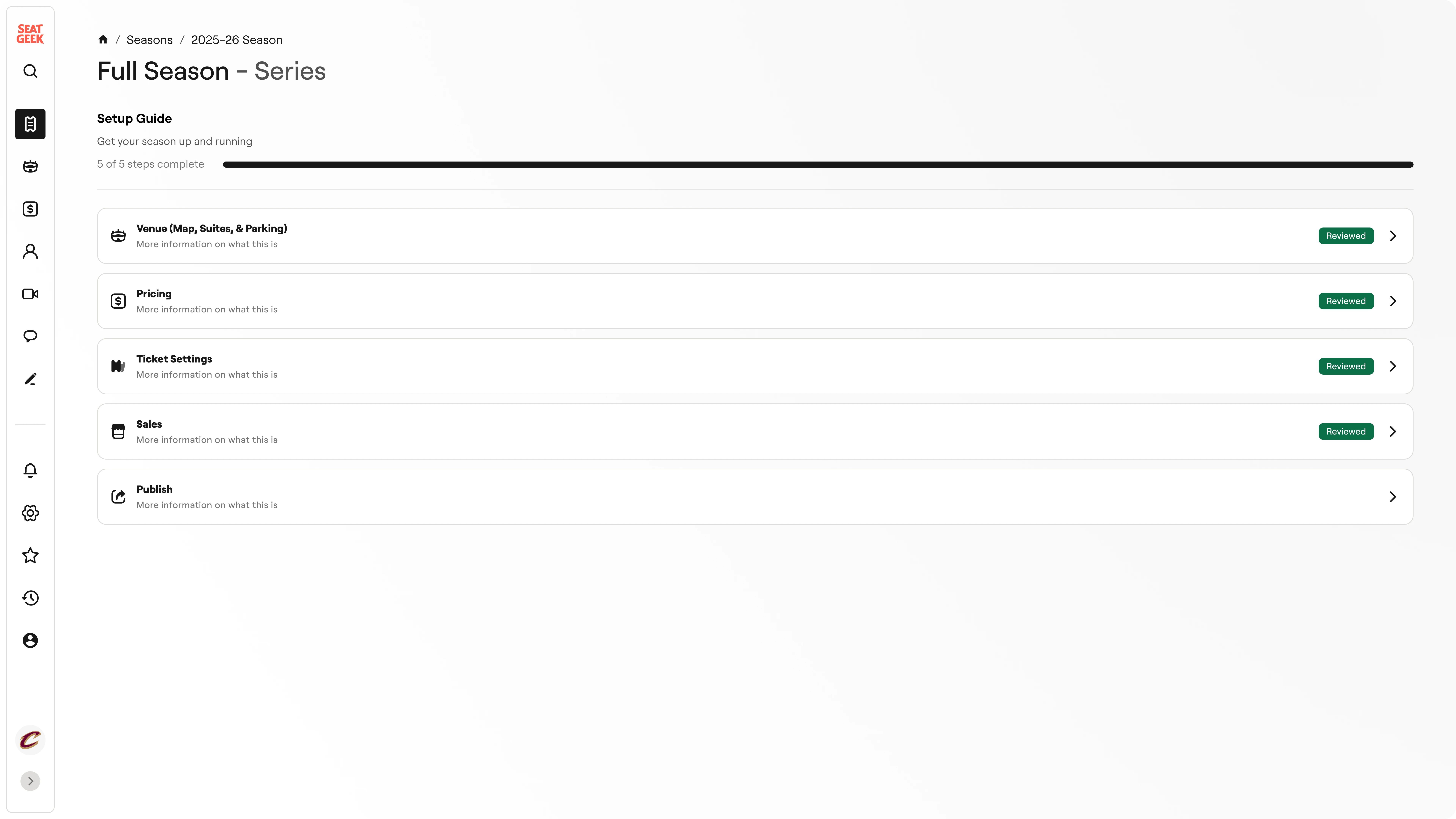
For individual season ticket configuration, a new onboarding style system guides users through the process, showing clear indicators of progress and highlighting next steps.
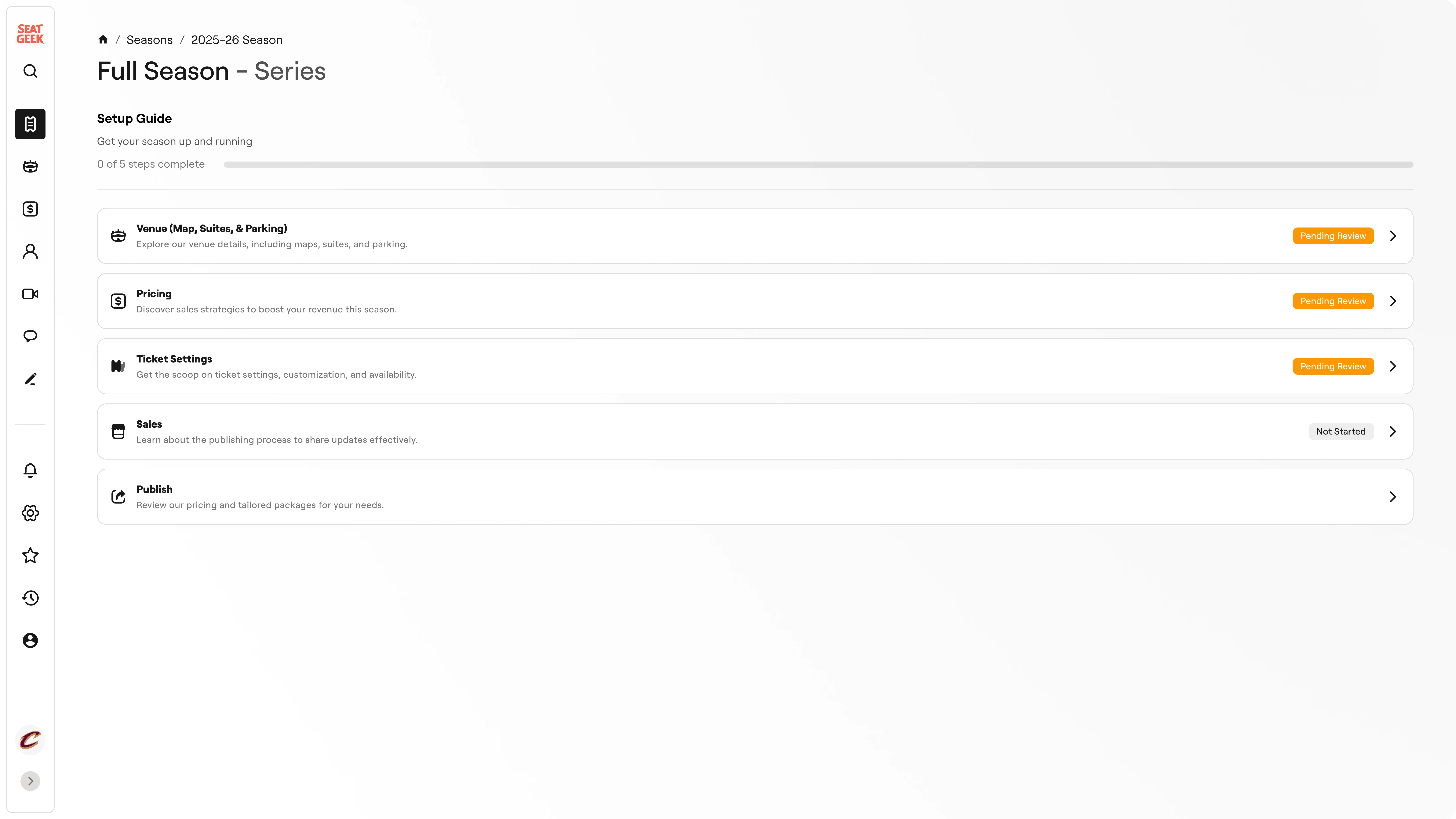
Series setup guide
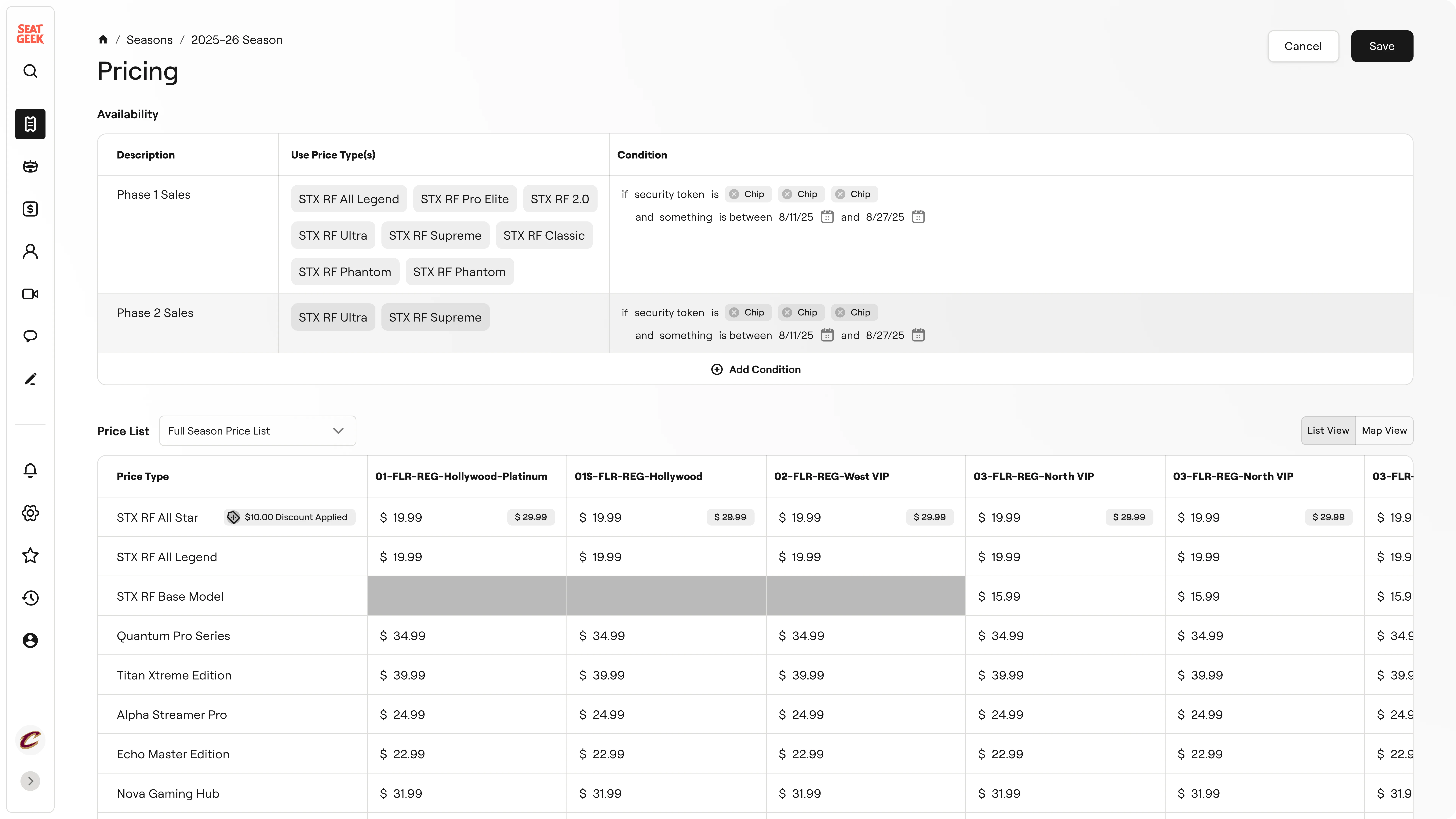
A new panel pattern was introduced, allowing visibility into both what's being configured as well as the consequences or result of changing something. Previously, a page navigation was required to access relevant information.
Old season ticket configuration
New season tickets overview
Old ticket pricing rules
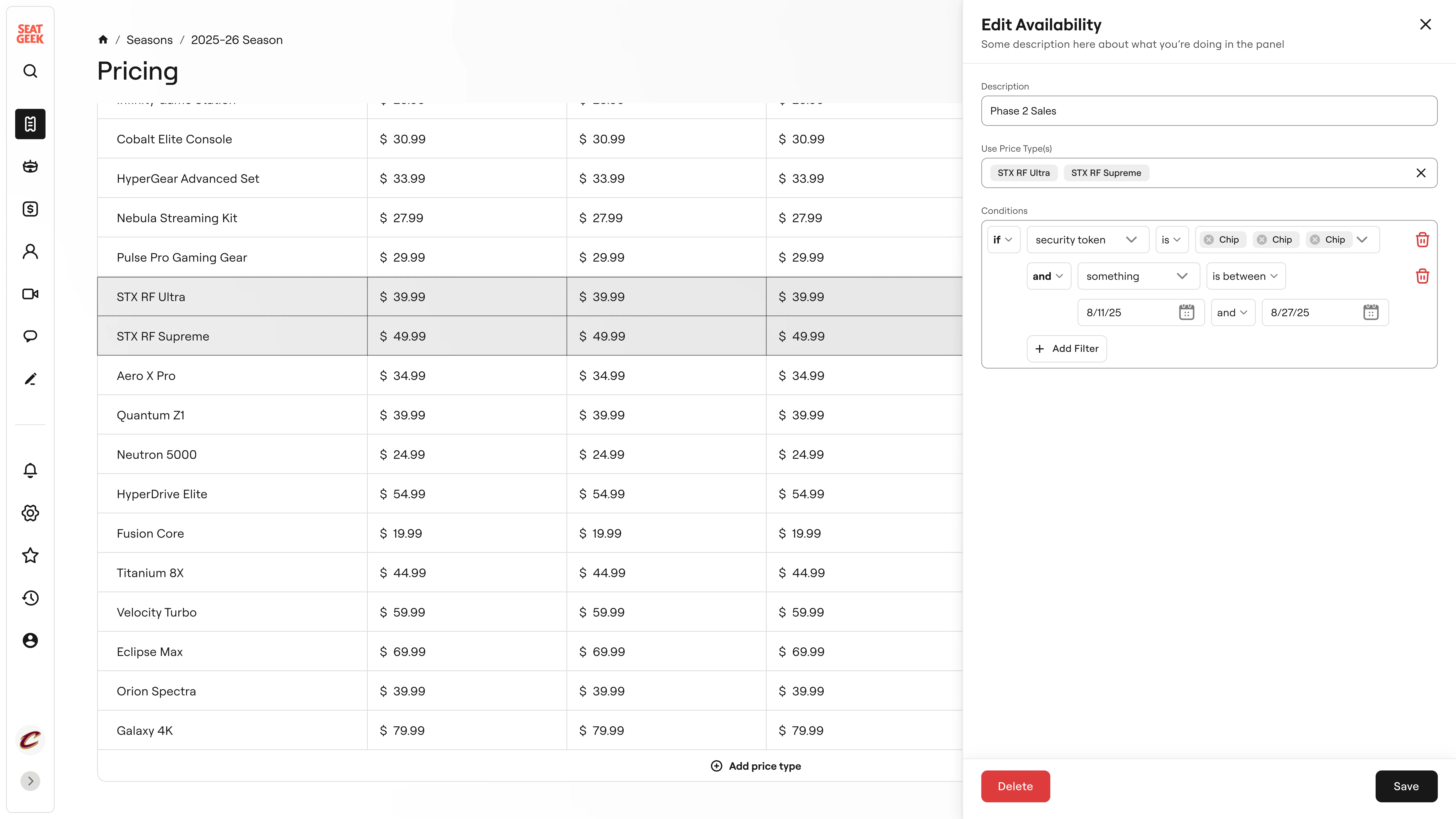
Pricing configuration panel
Configuration in general was also made to be much more visual, allowing users to see their configurations, reducing errors, improving readability, and providing validation.

Venue map configuration
Completed series setup guide
Multiple layers of review were also added, providing users with more confidence in their actions.
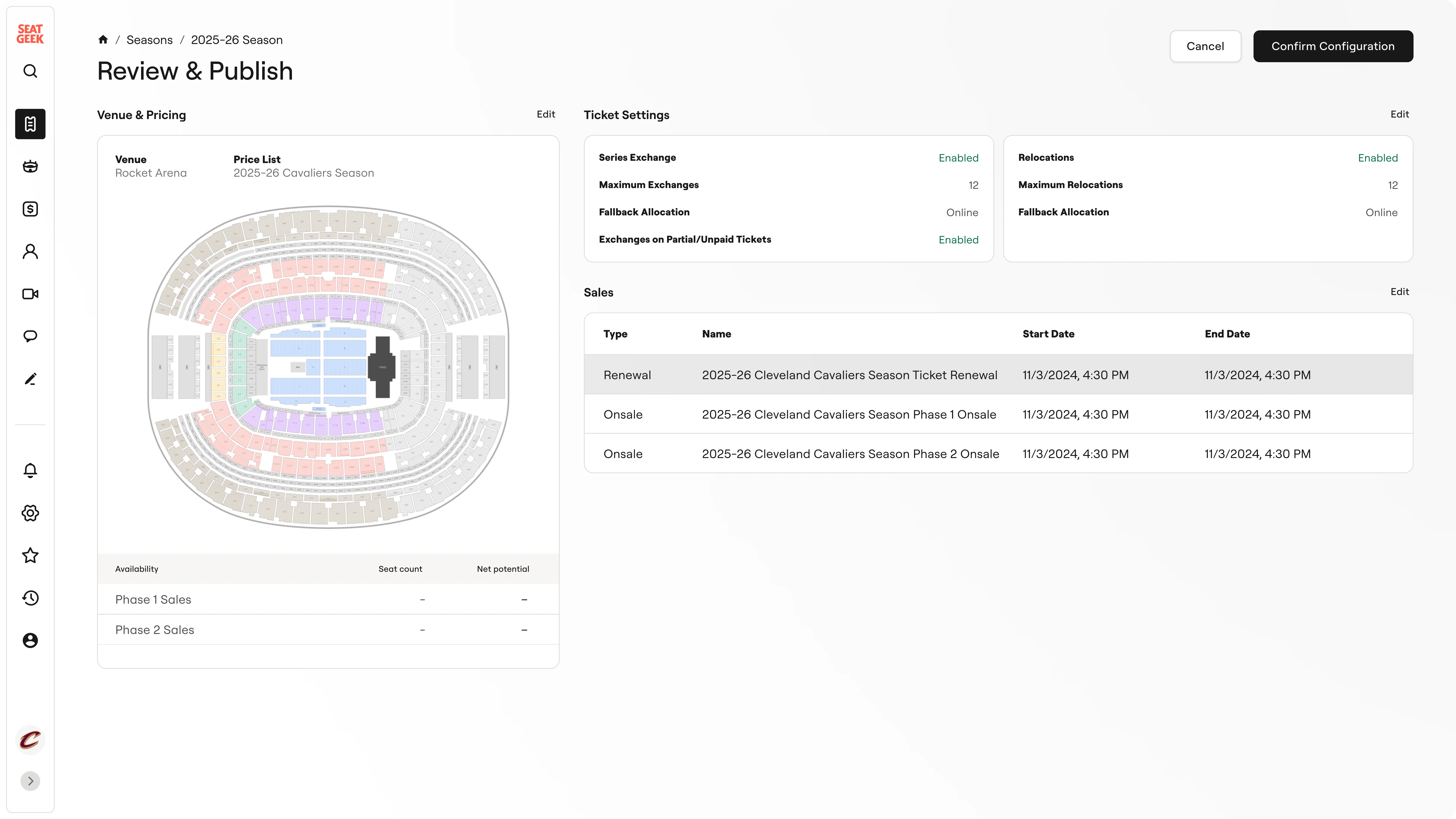
Initial configuration review and confirmation
And finally, upon completeing season setup, the UI shifts into a more dashboard like experience as user focus shifts from configuration to management with an emphasis on the live status. This is in contrast to the previous experience which remained a control panel for configuration.
Previous landing page (events preview)
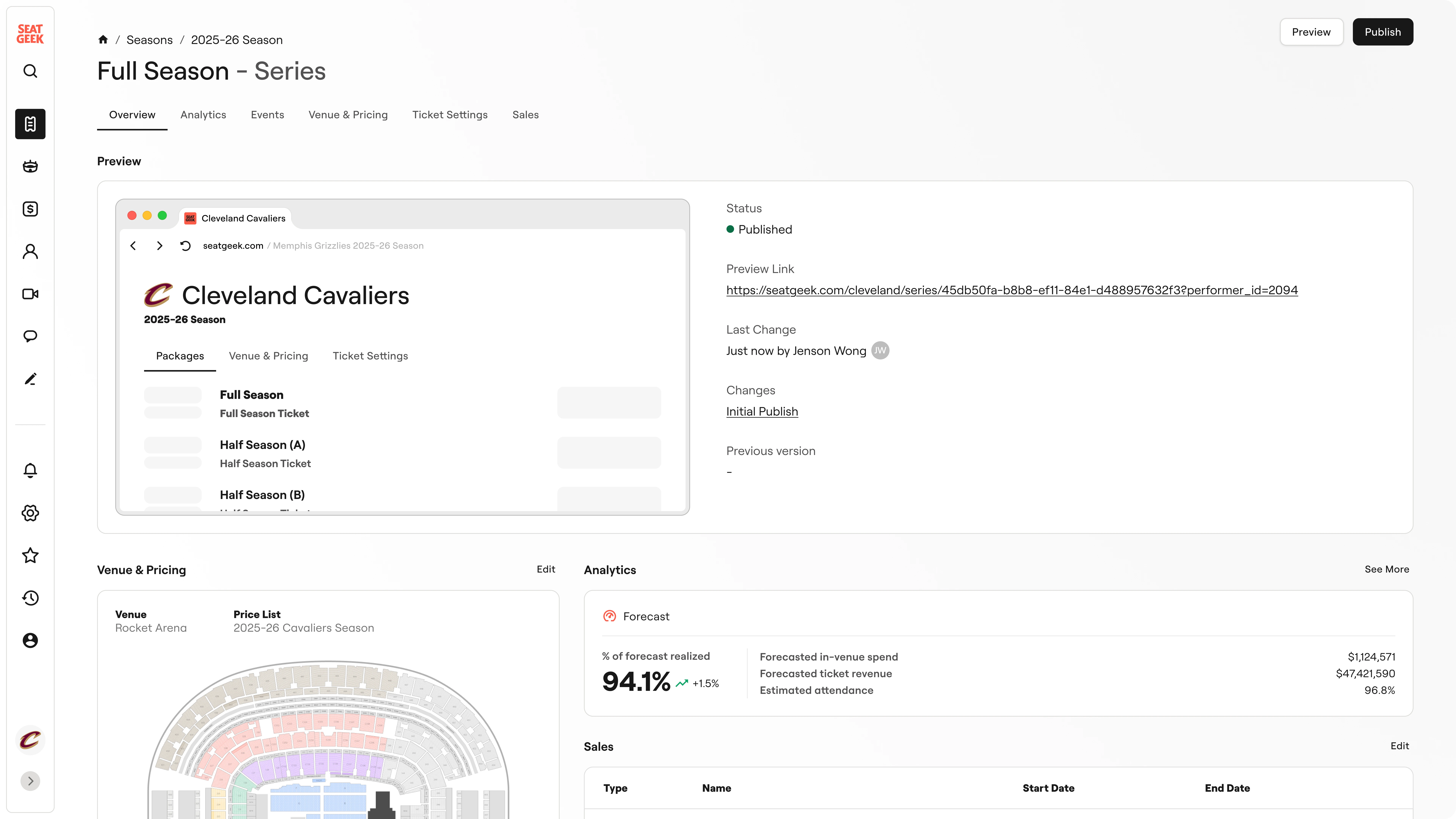
Ongoing season dashboard
Halftime Huddle
This project wasn't just about fixing any single page or flow, it was a system level change. To make sure the work could live beyond my internship, I put extra care into the handoff so the team had everything they needed to carry it forwards.
Handoff Materials
- High fidelity Figma designs along with a working Next.js prototype of the new season creation flow
- Diagrams of the new navigation structure and how current product features would fit in
- Comprehensive documentation of my entire design thinking process along with next steps for the team to explore
Postgame Analysis
In design, we often talk about keeping things simple. This project, though, taught me that complexity isn't always something to run away from.
Before this effort, the platform had been built entirely by engineers, and you could tell. It offered flexibility and power, but little opinion about how work should actually get done.
The role of design here was to transform that complexity from a burden into a strength. And doing so showed me that design isn't just how it looks, but how it works.
The End
This has been a long read and all pretty serious, so I appreciate you for making it all the way through. To end on a lighter note, here are a few highlights that capture some of the joy I had working on this project and at SeatGeek.

SeatGeek highlights