At Vendera, I was the founding designer responsible for the end-to-end design of our autonomous vending platform, owning everything from information architecture to UI design while also contributing to hardware, marketing, and product strategy.
If vending machines seem like a boring choice, it's because they are. But it also means a $24B industry where there hasn't been any change or innovation in decades. And so, we set out to change that.
Preview
In eight months, we built and shipped a platform that grew from zero to $90K MRR, secured $3M in funding at a $20M valuation, and onboarded 50+ operators managing over 200 machines. For those operators, switching from traditional machines to our solution delivered a 1.8x increase in average weekly sales.
Preview screens
Vending Machines…Seriously?
That's exactly what I thought when I was first asked to join the team. But after catching a machine restocker outside my university lecture hall off guard with way too many questions, I was quick to see just how wrong I was.
As someone who's been into business and technology my entire life, everywhere I'd ever worked had more data than they knew what to do with. And yet, in vending, they didn't have anything. Unless they were right in front of a machine, operators had no idea what products were inside, what items were selling, or when something had run out of stock.
These machines were black boxes, both literally and figuratively.
For small operators, this meant some minor invoncenience and some wasted restocking trips. But for large organizations with hundreds or thousands of machines, it meant whole networks of operators working blind and millions of dollars lost to payroll and poor product placement.
It was archaic, more like filling out a paper bathroom cleaning sheet than running a modern business. And so we asked:
Key Question
How might we design a system that enables vending operators to make data-driven business decisions?
What is Vendera?
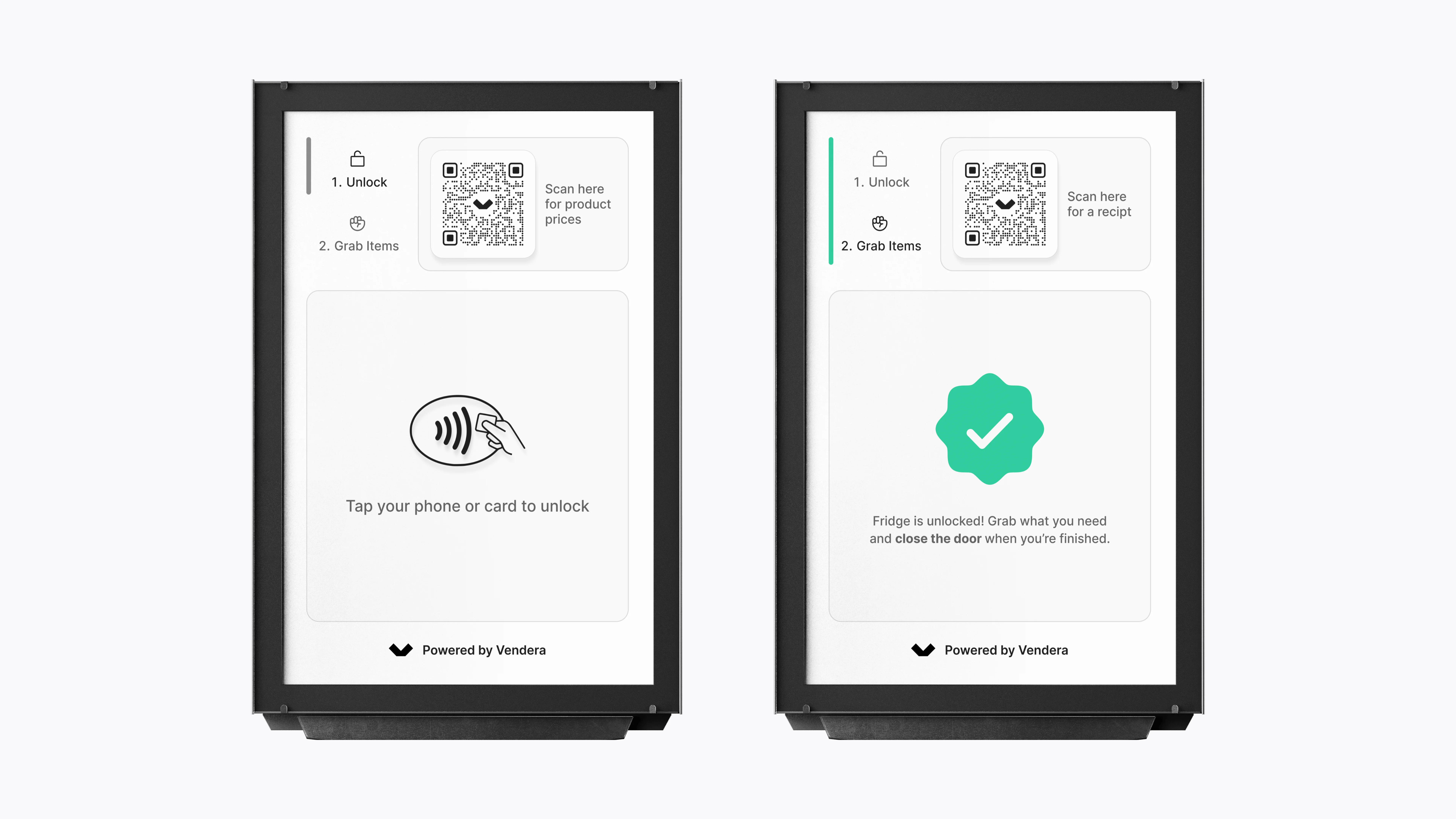
Our product was a fully integrated hardware and software solution. On the hardware side, we manufactured and built coolers where customers could tap to unlock, grab what they wanted, and have items automatically charged using computer vision.

Machine demo video
This got rid of the finnicky coil systems that leave your snacks stuck against the glass and allowed users to act more naturally by purchasing multiple items at once or inspecting something before putting it back, just like how you would shop at a supermarket.
Our real value, however, was in the software that operators would use to manage their business.
So How Do You Design a Vending Machine Anyways?
One of the biggest challenges designing for Vendera was that there really wasn't any precedent. Most people had never seen a vending machine that operated like this nor had operators ever used software designed specifically for their business needs. For me as a designer, that meant working through a lot of ambiguity and making foundational decisions from scratch. For instance, the platform.
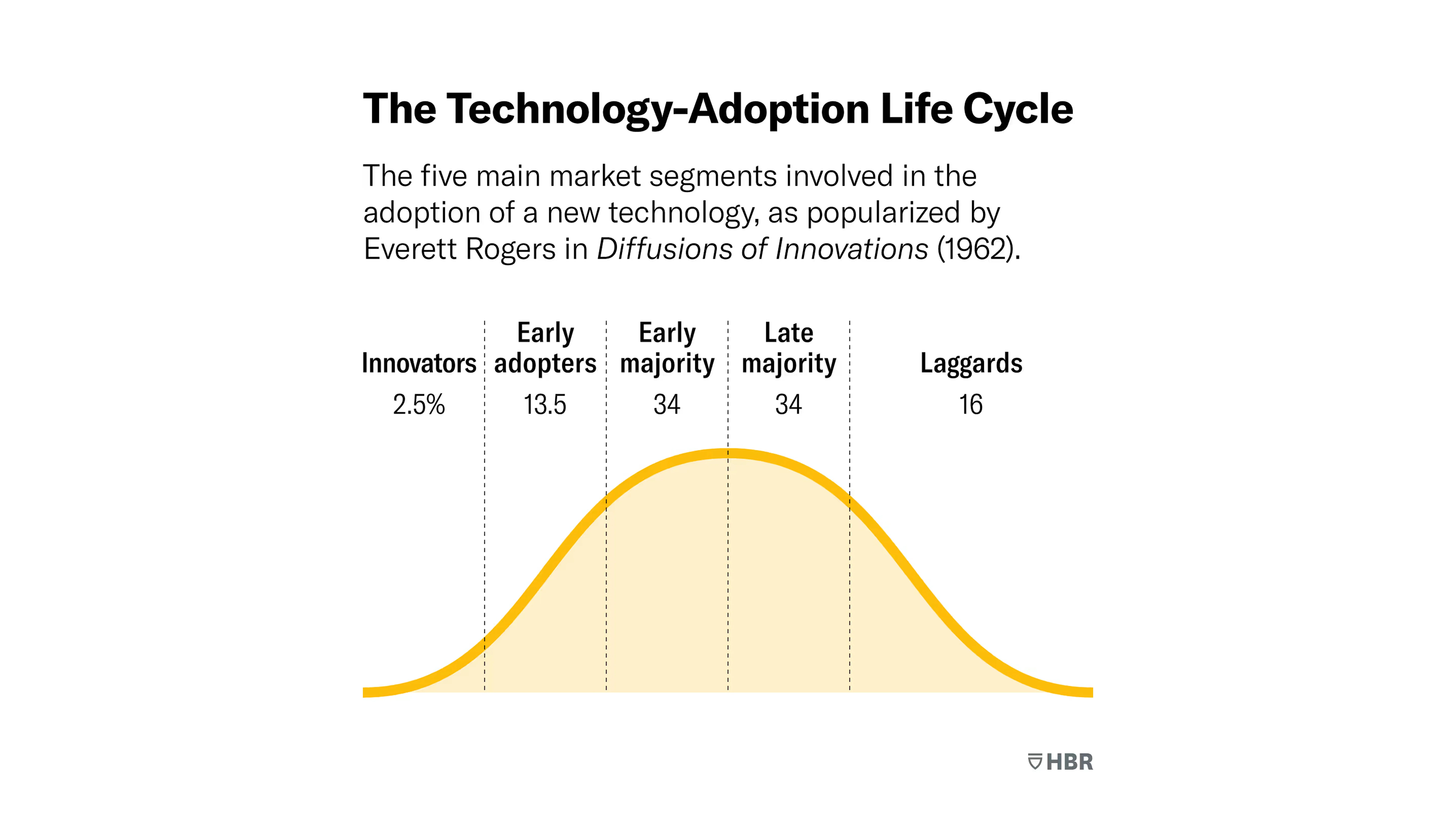
Source: Harvard Business Review (HBR)
Deciding where and how users would experience our software wasn't just a design choice, but a business one. As a new startup without a track record, I knew the largest national operators were unlikely to take a risk on us. Instead, the early adopters would be the small to medium sized operators, the ones less tied to legacy systems, more willing to experiment, and more motivated to grow.
By focusing here, we could prove our platform's effectiveness, build a data flywheel to improve our recognition algorithm, and help our customers scale. In turn, their success would give us credibility to later appeal to larger clients. That logic led me to pursue a mobile-first approach, one lightweight enough for small operations and low friction for in the field use.
E-Commerce asset
Working with my PM, we translated this strategy into a product roadmap, prioritizing mobile features first and placing a desktop web version further down the line as our clients and business matured.
So with a roadmap defined, I turned toward execution. The entire platform spanned dozens of workflows, but for this case study I'll focus on two examples.
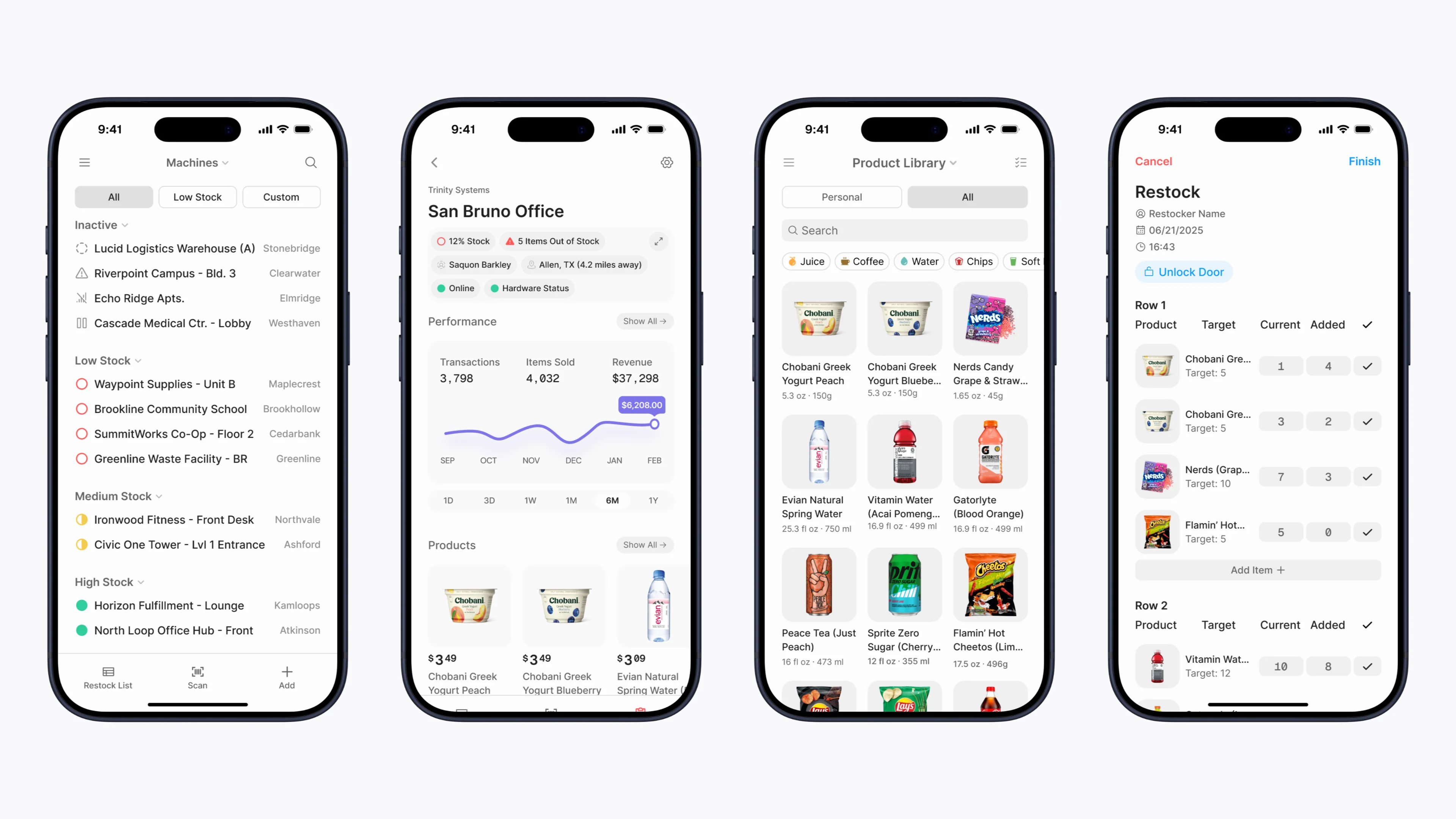
Feature 1: Machine List View
It was clear from the beginning that the core of our platform would be a high level overview of a client's operation, but it wasn't always clear what that would look like. The first key decision in creating this screen was the view type, of which I explored three options.
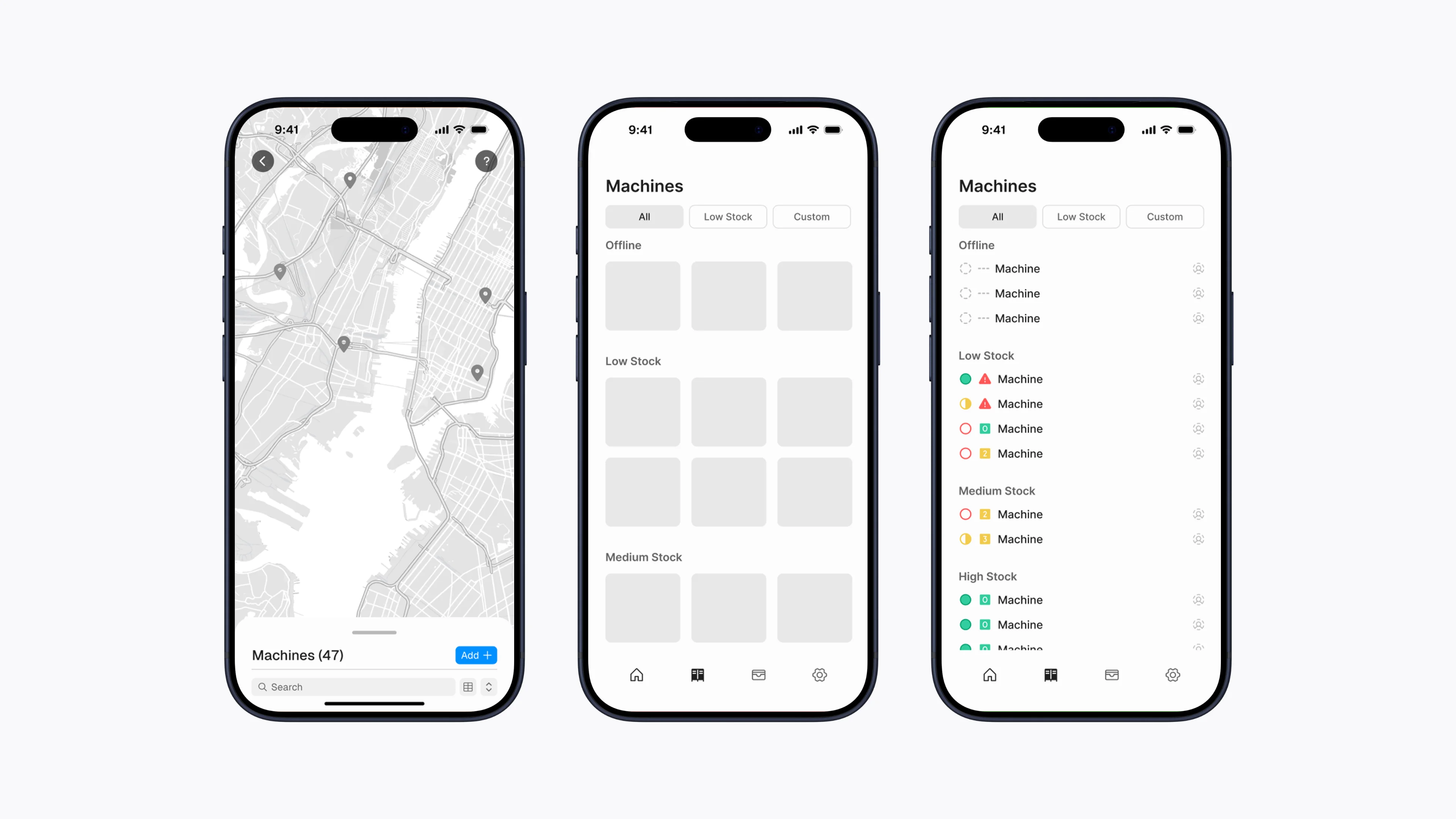
Machine list alternatives
Map
Highly visual and naturally aligned with a mental model based on location.
Prone to clutter, poor scalability, greater engineering difficulty, and limited actionability.
Grid
A balanced approach between visuals and information density.
Quickly overwhelming for large operations, encourages unnecessary information and bloated card designs.
List
Scalable, strong support for sorting/filtering, high information density, and low engineering cost.
Not very visual, prone to information getting lost or buried in a long list.
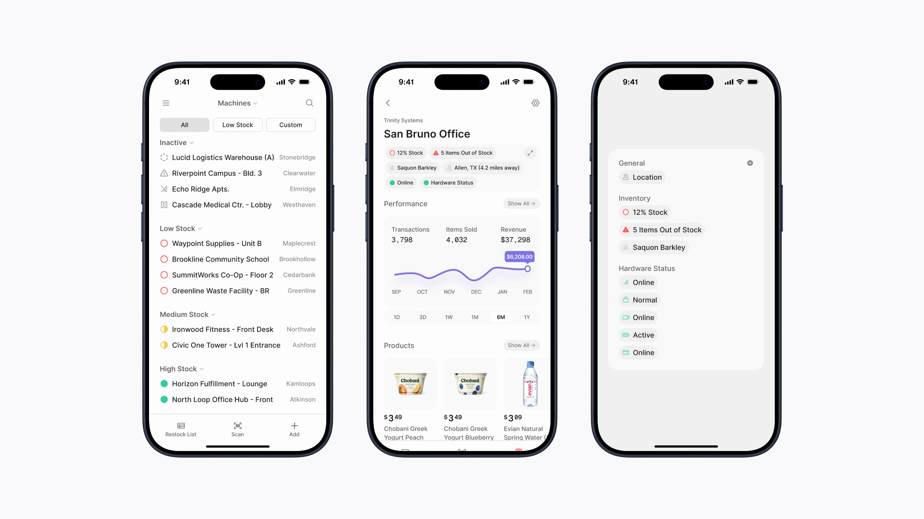
Ultimately, I chose the list view because it provided the best mix of clarity, scalability, and actionability. The next key decision was what to actually display for each machine.
Potential Attributes
- Machine name/ID
- Stock level
- Number of out of stock items
- Hardware status (temperature, lock, camera, etc.)
- Stock information (restocker, last restock, projected next restock)
- Location (city, state, country, etc.)
- Product information (top selling product, bottom selling product, number of products)
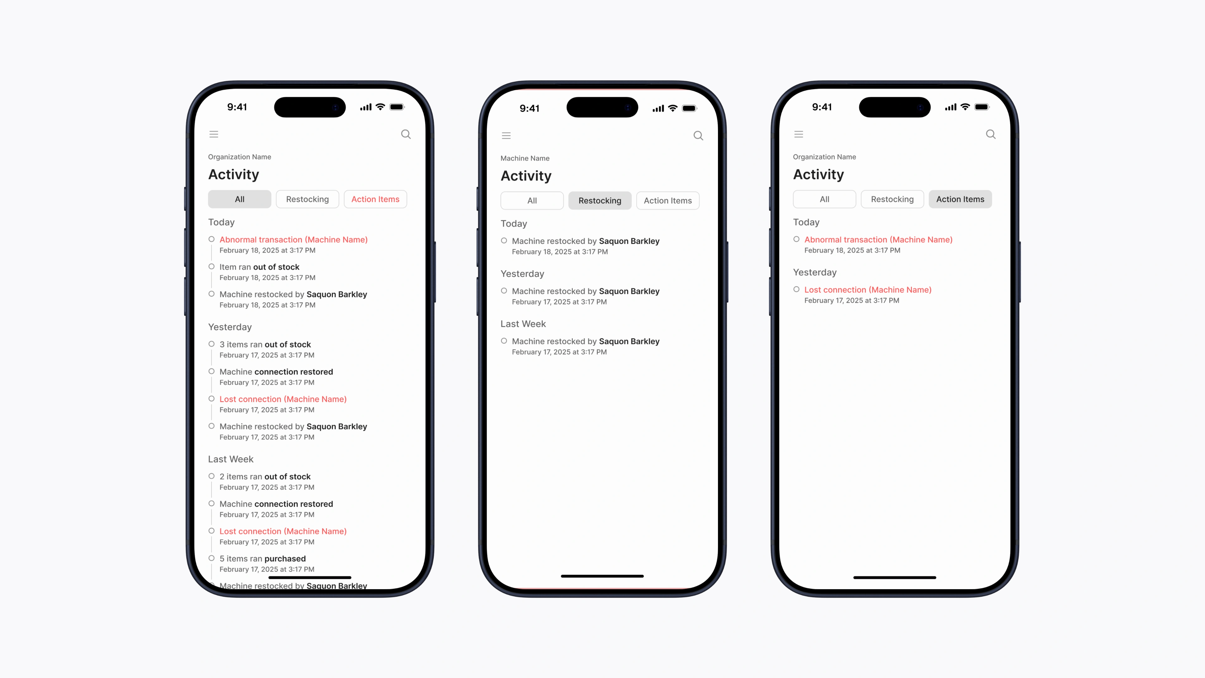
For this, the key was in understanding the job to be done. From an operational standpoint, this page serves as a high level overview of your machines, a quick pulse check to see if anything requires action.
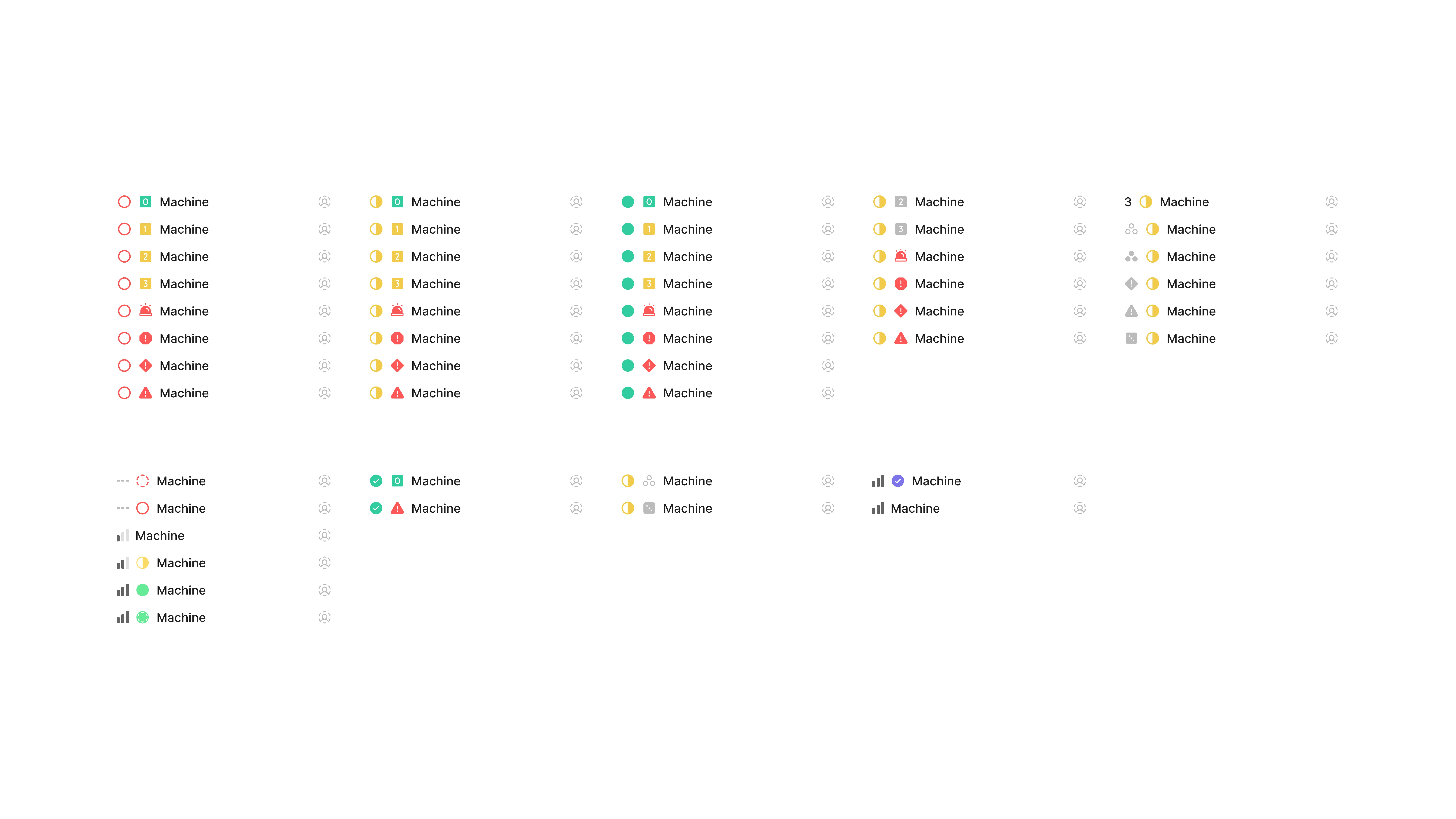
Machine list indicator exploration
After much iteration, I decided on a single icon slot that would represent stock level or hardware status if the machine wasn't operational. This, as part of the list view, sorted by actionability allowed operators to easily see which machines needed attention and to drill deeper only when necessary.
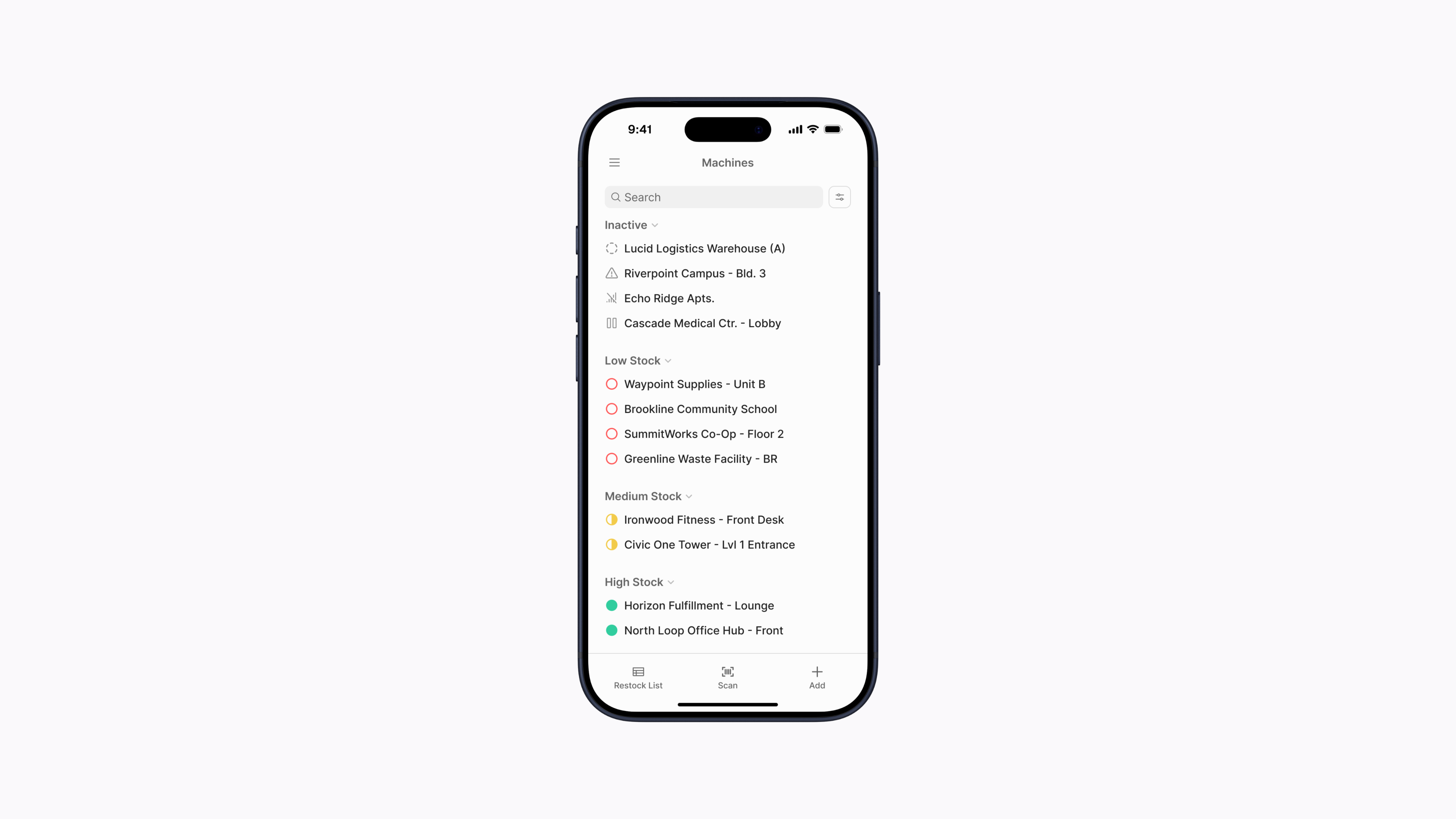
Machine list final design
In managing information density and providing the right level of detail, it also allowed for a scalable solution, one that would work well whether a client had five of five hundred machines.
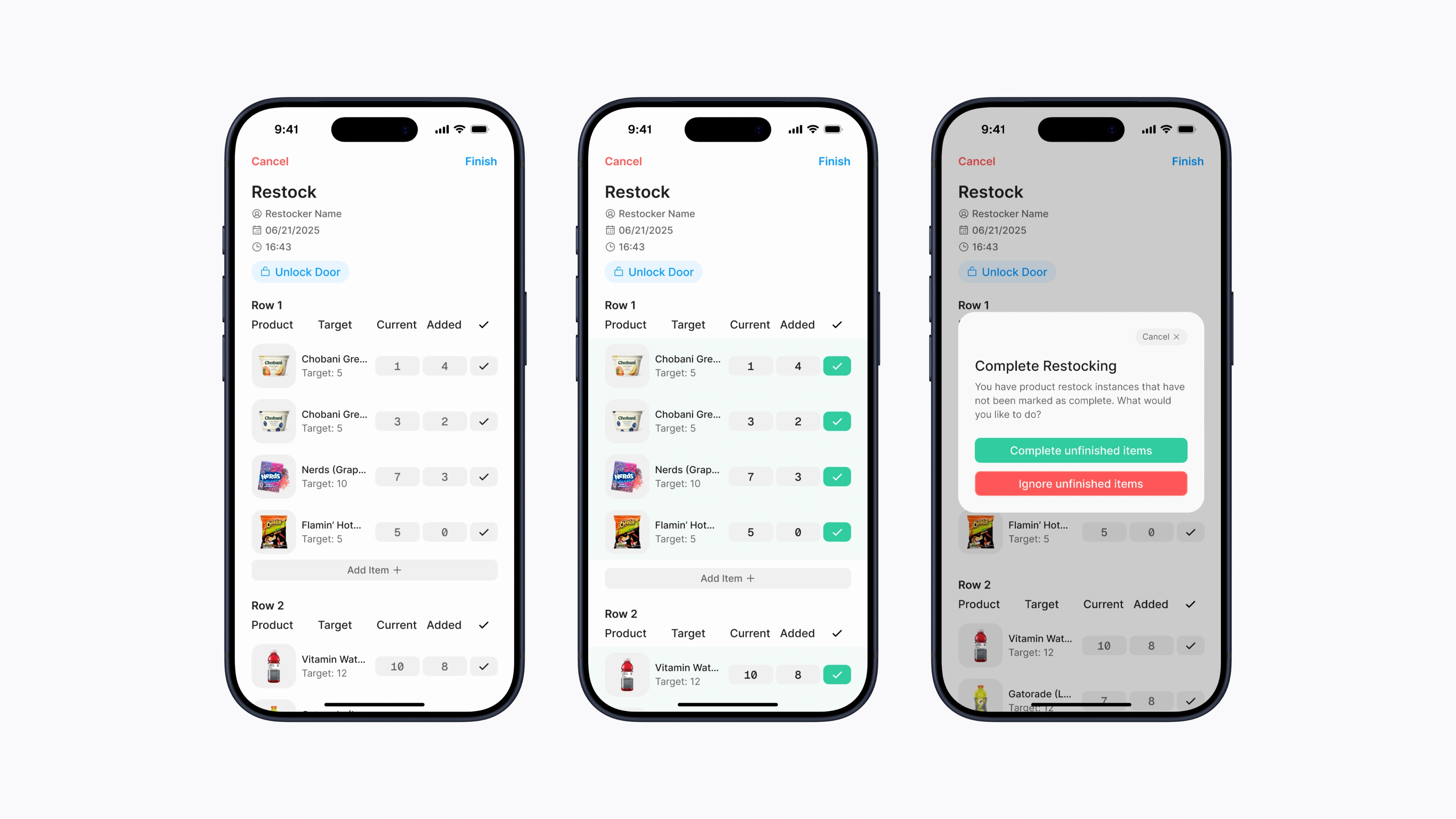
Feature 2: Restocking
Up until this point, everything I've covered has been a pure benefit to operators with better visibility and more data, all at no extra cost to their workflow. Restocking, however, was different. For the first time, we had to introduce an extra layer of friction.
In traditional vending, operators simply filled the machines and walked away. In our system, we asked to also track what they restocked so the system could maintain accurate inventory.
If this wasn't designed well, the extra adoption cost would leave users seeing it more as a burden than a benefit. And at first, that's exactly what happened.
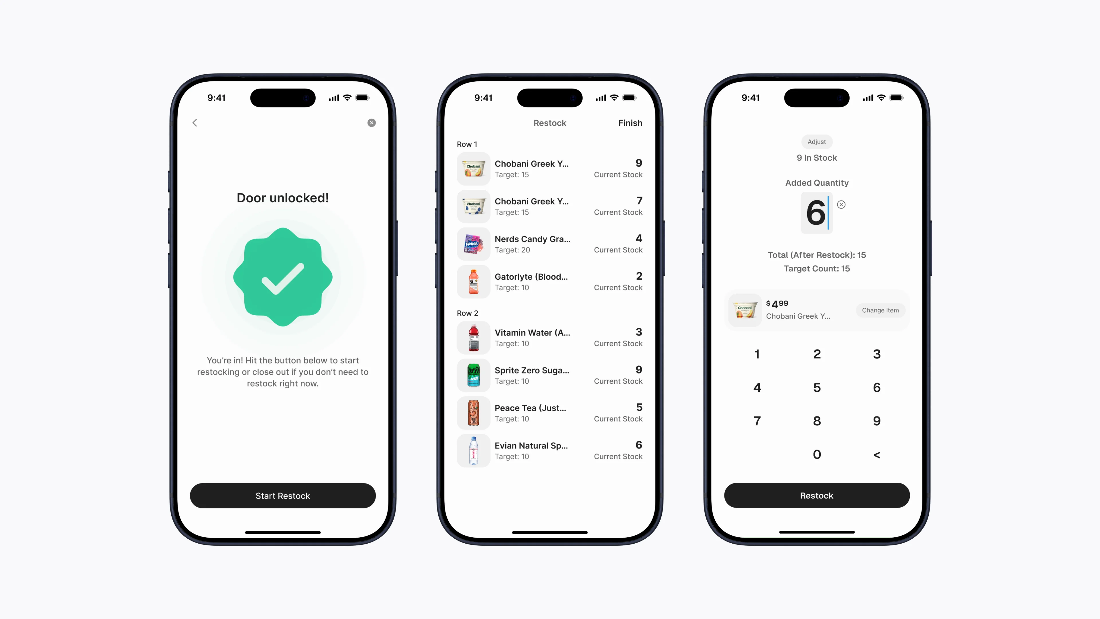
Original restocking flow
After lots of exploration, my original design introduced intentional friction, forcing users to handle products one by one. The goal was that this would slow users down to encouraging more thorough checking.
But after getting feedback from users and actually trying it myself, it was clear my intention had backfired. It did slow users down, but too much so. It felt tedious and encouraged rushing through, just like filling out a long survey.
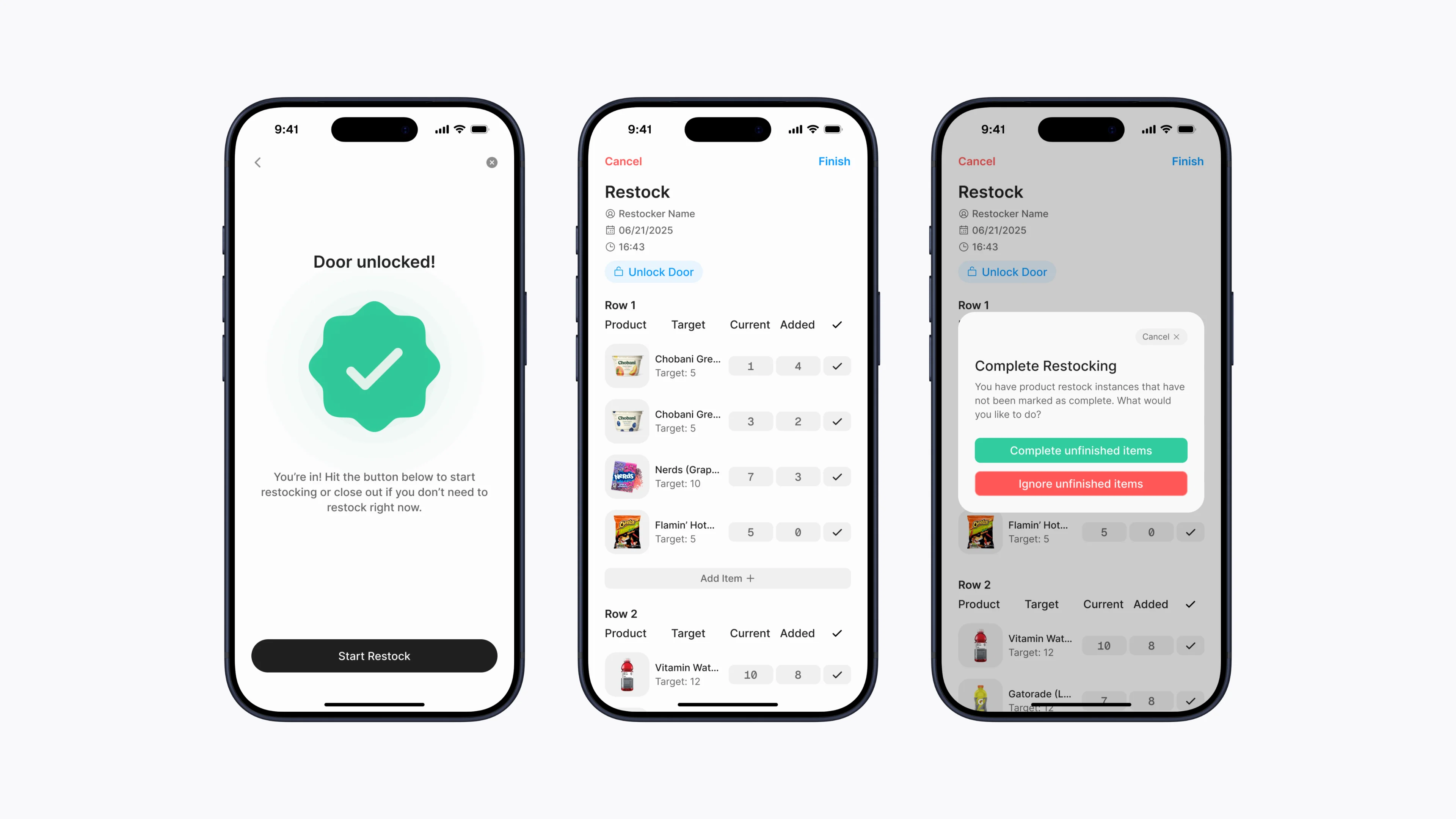
Final restocking flow
Completely reversing my approach, I then optimized for speed and information density in the hopes of creating something lightweight, something more like a helpful reminder rather than a chore.
The redesign introduced a fully editable list view. Operators could see the entire machine’s inventory at once, quickly adjust pre-calculated defaults if needed, or simply approve the list and let the system autofill.
Lessons Learned
Vendera was my first time working as a founding designer and being the point person for a whole company's product design direction. As startups usually are, it was messy, stressful, and often very frustrating, but also fun. I learned a lot in my time there. Here are some takeaways:
🔍 Have a holistic product perspective.
At Vendera, by the nature of our product, I was forced to think about more than just designing screens. In thinking through how the software connected with the hardware, how operators would use it in the field, and how business decisions shaped the product roadmap, I learned that being an effective designer also means being extremely open minded to learn things outside of the discipline.
🤝 Trust design intuition.
Like I said earlier, nobody designs for vending. And so, this was the first design project I've done where it wasn't easy for me to just hop online and find hundreds of screens for competitor implementations. In forging a new path, it helped me discover that design isn't just listening to users, but having conviction in a long term product vision and effectively filtering the signal from the noise to get there.
🎨 Design kinda matters a lot.
The absence of good design isn't no design, it's bad design. Poor experiences, inefficiencies, and wasted potential are all the result of design decisions, or the lack thereof, and fixing them has the power to transform an entire industry.
Appendix
Though this has been quite a bit of content already, a case study of this length just isn't enough to contain my entire design journey at Vendera, so here's a little of everything else.

Product video
POS
Machine list
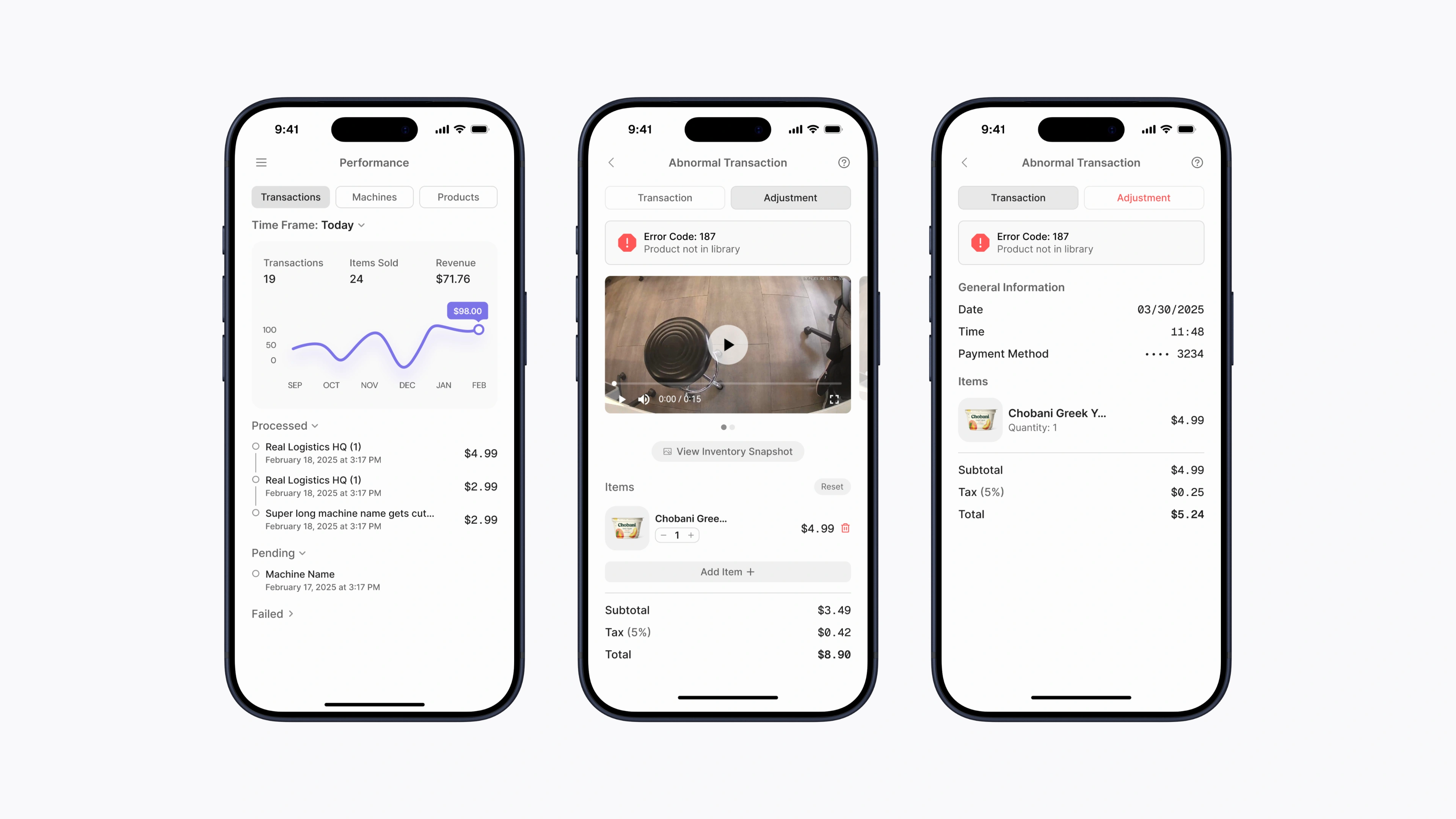
Analytics
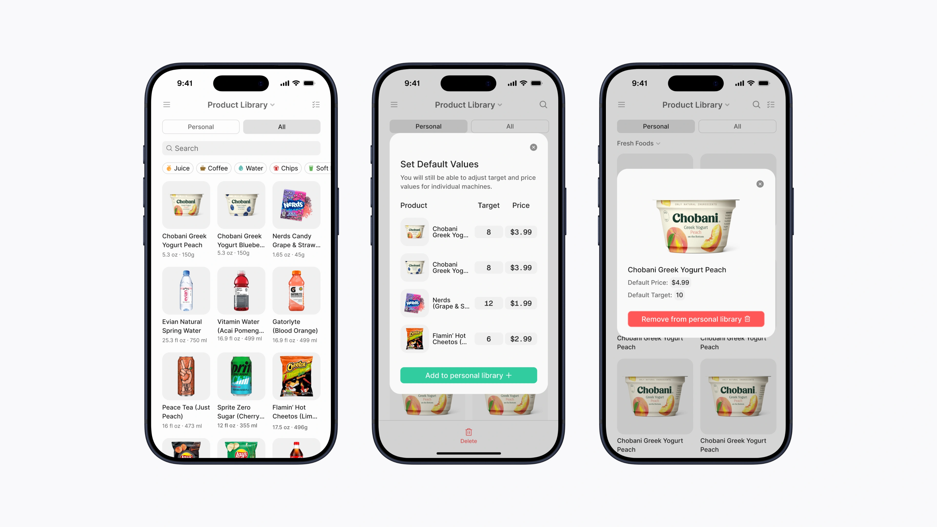
Product library
Activity feed
Restocking flow
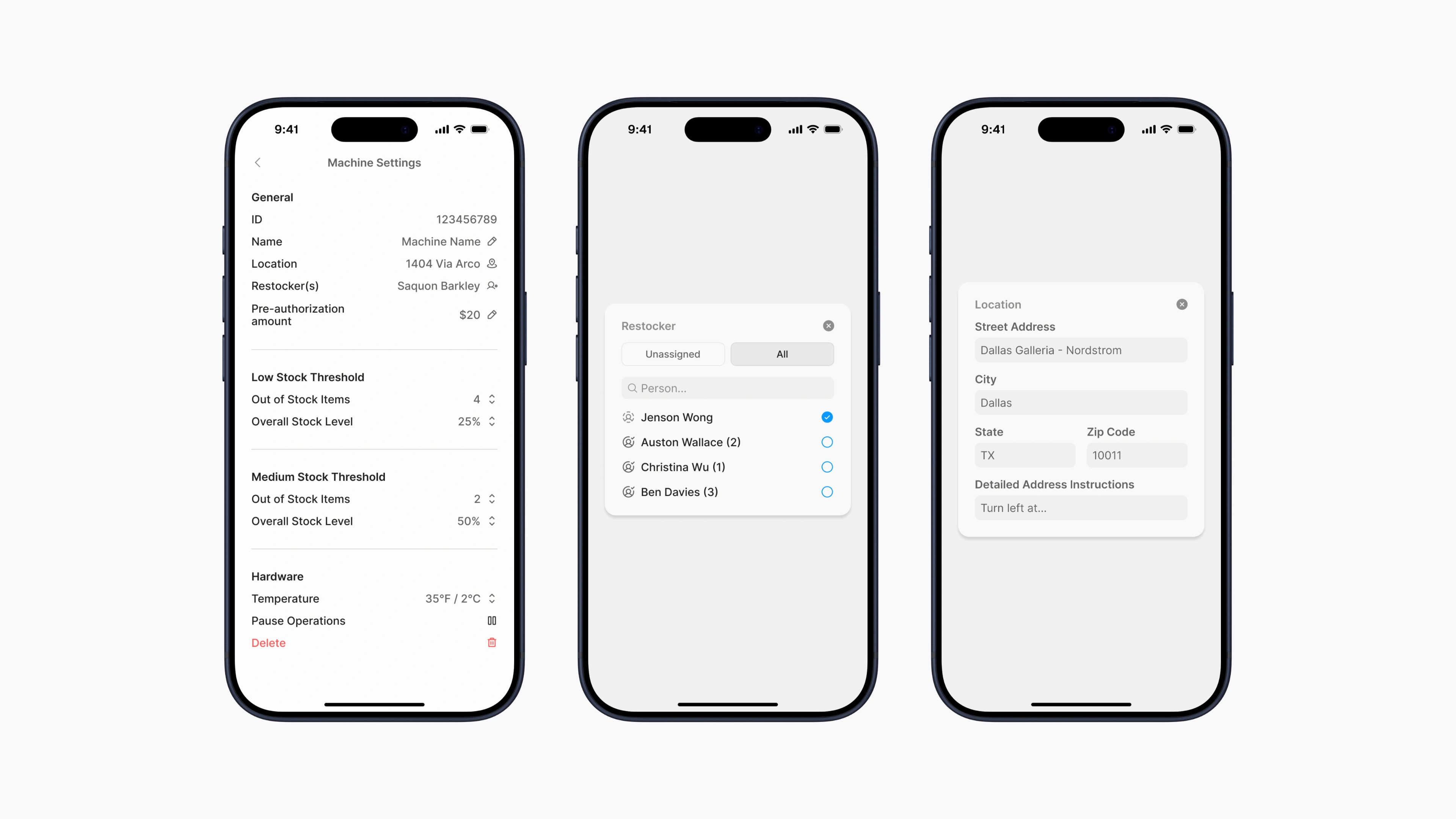
Machine settings